Creating a Responsive Navbar with JavaScript
Creating a Responsive Navbar with JavaScript
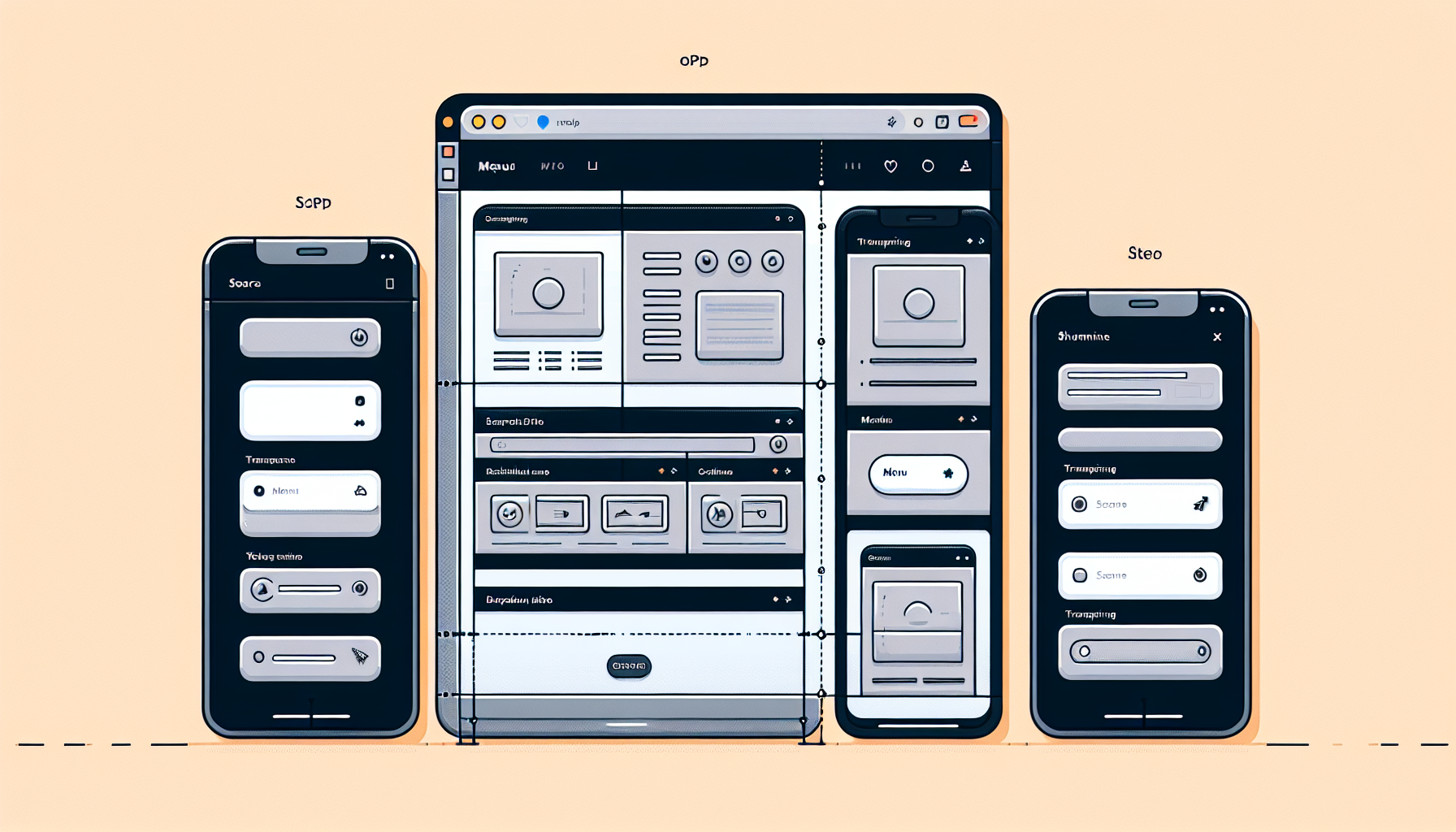
One of the essential elements in web development is creating a responsive navbar.
This ensures that users can navigate your site easily on any device.
Whether you are using a mobile phone, tablet, or desktop, a responsive navbar will adjust itself accordingly.
**TL;DR: How to Create a Responsive Navbar with JavaScript?**
To create a responsive navbar, use JavaScript to toggle classes and adjust the styles dynamically.
// Basic HTML structure of a navbar
// CSS for basic styling
// JavaScript to handle the responsive behavior
// CSS for toggling the navigation toggle
In this example, the JavaScript code toggles the class of the nav-links when the button is clicked, making them visible on smaller screens.
Continue reading the article for a step-by-step guide on creating and styling your responsive navbar.
Setting Up the Basic HTML Structure
The first step to creating a responsive navbar is setting up the HTML structure.
This includes defining a nav tag, within which you will place your links, logo, and toggle button for mobile view.
Here is a basic example:
This structure forms the skeleton of your navbar.
The unordered list (ul) contains each navigation link (li), which itself contains anchor tags (a).
Styling the Navbar with CSS
Next, you need to style the navbar using CSS.
This involves defining the layout, colors, and making it responsive using media queries.
Add the following CSS:
This CSS will format the navbar for both desktop and mobile views.
The @media query hides the navigation links on smaller screens and displays the toggle button.
Adding Interactivity with JavaScript
To make the navbar responsive, you need to add JavaScript to handle the toggle button click event.
This requires selecting the button and navigation links, then toggling an active class whenever the button is clicked.
Here is the JavaScript:
This script makes the navbar interactive on smaller screens by showing or hiding the links when the button is clicked.
Testing the Responsive Navbar
After coding, always test your responsive navbar.
Open your website on various devices like smartphones, tablets, and desktops to ensure all elements are working as expected.
If anything doesn’t look right, adjust your CSS and JavaScript accordingly.
Common Issues and How to Fix Them
Issues with CSS Not Applying Correctly
Ensure all your CSS is scoped correctly to your HTML elements.
Use browser developer tools to inspect elements and see what’s being overridden.
JavaScript Not Working
Check your browser console for any errors in the JavaScript.
Ensure your script is linked correctly, and your elements have proper IDs.
Navbar Not Toggling on Small Screens
Double-check your media queries and ensure the CSS is correct for smaller screens.
Verify that the toggle button and navigation links have the right classes assigned.
Frequently Asked Questions
How do I center the logo in the navbar?
You can adjust the CSS to center the logo using flex properties like this:
Can I use JavaScript libraries for the responsive navbar?
Yes, you can use libraries like jQuery or frameworks like Bootstrap to simplify the process.
These tools provide pre-built components, including responsive navbars.
How do I add animations to the navbar?
You can add CSS transitions to the navbar links for smooth toggling effects.
For example, add a transition property to the .nav-links
What is the best way to handle dropdowns in the navbar?
Use CSS for basic dropdown functionality and JavaScript for advanced features.
Ensure that nested links are visible when the parent link is hovered or clicked.
Is it necessary to use ARIA attributes for accessibility?
Yes, including ARIA (Accessible Rich Internet Applications) attributes improves accessibility.
Attributes like aria-expanded and aria-controls enhance user experience for screen readers.
By following these steps and using the provided code, you’ll be able to create a responsive navbar with JavaScript that works seamlessly across different devices.
Enhancing the Responsive Navbar
Now that you have a basic responsive navbar, let’s explore ways to enhance it.
Adding more functionality and styles can make the navigation experience even better.
Adding Dropdown Menus
Dropdown menus are a common requirement for many websites.
They allow you to organize links and make the navbar more comprehensive.
Here’s how to add a dropdown menu:
This adds a nested unordered list inside the Services link.
Next, style the dropdown menu with CSS:
This CSS makes the dropdown appear when hovering over the Services link.
Feel free to adjust the styles for your specific needs.
Adding Smooth Scrolling
Smooth scrolling enhances the user experience by creating a seamless navigation flow.
Users appreciate the aesthetic touch it adds when clicking on navbar links.
Implement smooth scrolling using this JavaScript:
This script adds smooth scrolling to all navbar links.
When a link is clicked, the browser smoothly scrolls to the target section.
Implementing Sticky Navbar
A sticky navbar remains at the top of the page when scrolling down.
This keeps navigation always accessible and enhances usability.
Here’s how to make the navbar sticky:
This CSS keeps the navbar fixed at the top of the page.
Adjust the styling as needed.
Toggling ARIA Attributes for Accessibility
ARIA attributes improve accessibility for screen readers.
They provide additional information about the state of interactive elements.
Update your JavaScript to toggle ARIA attributes:
This script updates the aria-expanded and aria-hidden attributes.
It ensures that screen readers correctly interpret the state of the navbar.
Optimizing the Navbar for Performance
Optimization improves loading times and responsiveness.
There are several ways to optimize your navbar:
Minify CSS and JavaScript to reduce file sizes.
Use a content delivery network (CDN) for libraries like jQuery or Bootstrap.
Lazy-load images or other media elements to improve initial loading times.
These practices ensure a smooth and fast user experience.
Performance optimization is an ongoing process, so regularly test and update your code.
Frequently Asked Questions
Why isn’t my CSS being applied correctly?
Ensure your CSS file is correctly linked in the HTML head section.
Use browser developer tools to inspect elements and debug issues.
How do I make my navbar fixed at the top?
Use the CSS position: fixed property to keep it at the top.
Adjust the top property if needed.
Can I use a pre-built library for my navbar?
Yes, libraries like Bootstrap offer pre-built responsive navbars.
These can simplify development and ensure cross-browser compatibility.
How do I handle nested dropdown menus?
Use CSS for basic nesting and JavaScript for more complex interactions.
Ensure each level of the dropdown remains accessible and visually distinct.
Why isn’t my JavaScript working?
Check your browser console for any error messages.
Make sure your script is correctly linked and elements have the right IDs.
By following these advanced techniques and troubleshooting tips, you can create a highly functional and visually appealing responsive navbar.
Shop more on Amazon